pacman::p_load(tidyverse, lubridate, arrow, sf, ggmap, ggrepel)10 Revisits
While Track reveals where devices go, Revisits reveals who keeps coming back. This chapter shows how to classify detected devices by visit frequency, distinguishing returning visitors from one-time visitors based purely on how often they appear.
This metric was formerly termed identity, following Teixeira et al.’s human-sensing taxonomy; it has been renamed to Revisits to better reflect its privacy-preserving scope: device-level visit patterns rather than any form of personal identification.
The core insight is that visit frequency reveals a revisit profile. A device detected on 5+ of the 7 deployment days is likely a returning visitor, often a campus resident; one seen only once is probably passing through. If this distinction is meaningful, we should see clear behavioral differences across multiple dimensions: when each group appears, where they concentrate, how widely they range, and how they move through the campus.
10.1 Setup
Prepare data
Download our sample dataset to follow along, or use your own WiFi detection data: sample_main.zip. The ZIP contains three files: wifi.parquet (WiFi detections), sensors.gpkg (sensor locations), and poi.gpkg (campus landmarks).
NoteAbout the sample dataset
This chapter uses the same UNIST campus dataset introduced in Count: see that chapter for the period, sensor coverage, schema, and preparation steps.
Load packages and data
Load required packages using pacman::p_load(), which installs any missing packages automatically:
Load the data files:
wifi <- read_parquet("../workflow/unist19_main/data/wifi.parquet") |>
  mutate(date = as_date(timestamp), hour = hour(timestamp))

sensors <- st_read("../workflow/unist19_main/data/sensors.gpkg", quiet = TRUE)
TipPreview loaded data
head(wifi, 3) timestamp source_address sensor_name rssi_median rssi_sum n detections date hour
1 2019-10-28 00:00:00 014ca1637458 PC_room_front -76.5 -1371 61 18 2019-10-28 0
2 2019-10-28 00:00:00 02f35e3b75cf football_field_front -65.0 -461 132 7 2019-10-28 0
3 2019-10-28 00:00:00 03cac8c223f6 202_back -74.0 -74 2 1 2019-10-28 0timestamp: Start of 20-second aggregation windowsource_address: SHA-256 hashed device identifier (first 12 characters)sensor_name: Which sensor detected this devicedate: Date extracted from timestamphour: Hour of day (0–23)
10.2 Classify by Visit Frequency
WiFi sensors detect every device that broadcasts a probe request: residents, commuters, delivery drivers, and one-time visitors alike. To distinguish these populations, we use the simplest available signal: how many of the 7 deployment days each device was observed. A device seen on a single day is likely passing through; one detected on 5+ days is very likely a returning visitor.
Classify devices
We count the number of unique days per device. The resulting distribution shows a clear structure: 40% of all devices appear on just a single day, while 33% persist for 5+ days. Based on this, we define three categories: One-time (1 day), Occasional (2–4 days), and Returning (5+ days; labeled “Regular” in the code below). We then join the labels back to the detection data.
regular_threshold <- 5  # days (5+ out of 7 ≈ present most days)

device_days <- wifi |>
  group_by(source_address) |>
  summarise(n_days = n_distinct(date)) |>
  mutate(freq_type = case_when(
    n_days == 1 ~ "One-time",
    n_days >= regular_threshold ~ "Regular",
    TRUE ~ "Occasional"
  ))

wifi <- wifi |>
  left_join(device_days |> select(source_address, freq_type), by = "source_address")

device_days |> count(freq_type, sort = TRUE)
# A tibble: 3 x 2
freq_type n
<chr> <int>
1 One-time 6936
2 Regular 5821
3 Occasional 4726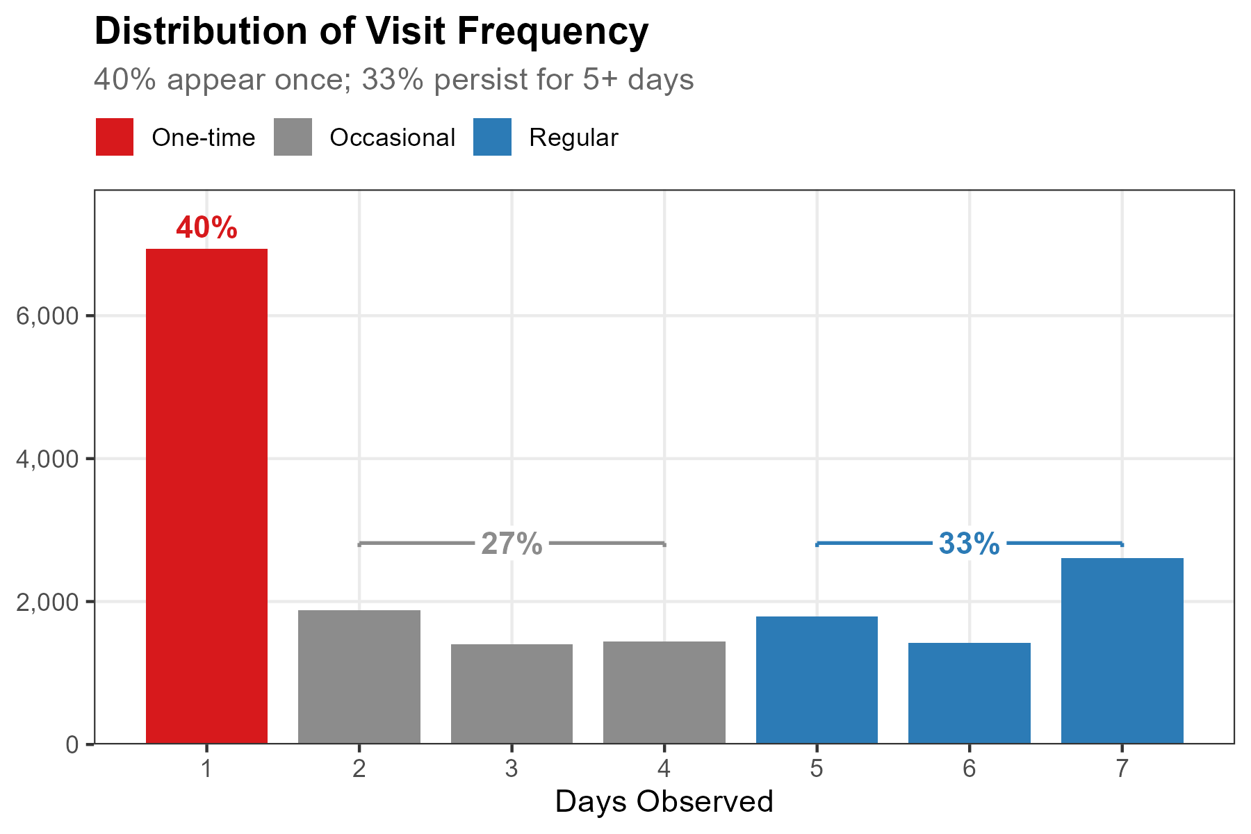
NoteShow code
dist_data <- count(device_days, n_days) |>
  mutate(freq_group = factor(
    case_when(n_days == 1 ~ "One-time", n_days >= regular_threshold ~ "Regular",
              TRUE ~ "Occasional"),
    levels = c("One-time", "Occasional", "Regular")
  ))

ggplot(dist_data, aes(n_days, n, fill = freq_group)) +
  geom_col(width = 0.8) +
  scale_fill_manual(
    values = c("One-time" = "#d7191c", "Occasional" = "gray55", "Regular" = "#2c7bb6"),
    name = NULL) +
  scale_x_continuous(breaks = seq(1, 7)) +
  scale_y_continuous(labels = scales::comma, expand = expansion(mult = c(0, 0.12))) +
  labs(title = "Distribution of Visit Frequency",
       x = "Days Observed", y = NULL) +
  theme_bw()
Notably, the 7-day bar (2,610 devices) is taller than the 5-day or 6-day bars: these are devices detected every single day of the deployment, a reliable signal of campus residents.
Now we compare the two extremes, One-time vs Returning (Regular), across four behavioral dimensions: temporal patterns, spatial concentration, spatial coverage, and movement flows.
10.3 Behavioral Differences
Temporal pattern
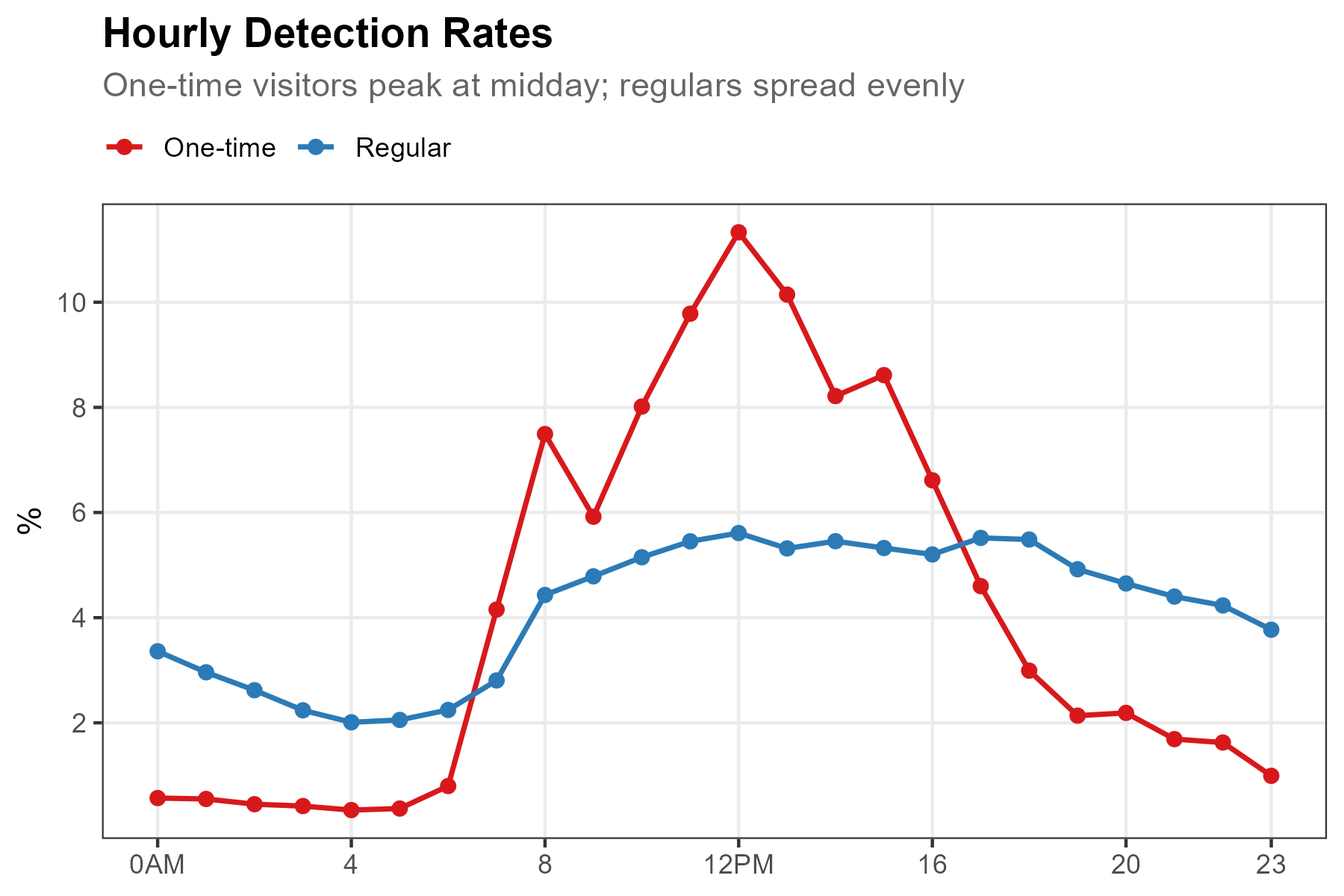
One-time visitors cluster tightly around midday (peaking at ~11% of their devices at hour 12), concentrated within business hours 8am–5pm. Returning visitors, by contrast, spread across the full 24 hours at roughly 2–5.5% per hour, a flat profile reflecting on-campus residents who are detectable even at night.
NoteShow code
wifi_freq <- wifi |> filter(freq_type %in% c("One-time", "Regular"))

h_freq <- wifi_freq |>
  group_by(freq_type, hour) |>
  summarise(n = n_distinct(source_address), .groups = "drop") |>
  group_by(freq_type) |>
  mutate(pct = n / sum(n) * 100)

ggplot(h_freq, aes(hour, pct, color = freq_type)) +
  geom_line(linewidth = 0.8) + geom_point(size = 1.8) +
  scale_x_continuous(breaks = c(0, 4, 8, 12, 16, 20, 23),
                     labels = c("0AM", "4", "8", "12PM", "16", "20", "23")) +
  scale_y_continuous(breaks = seq(2, 10, 2)) +
  scale_color_manual(values = c("One-time" = "#d7191c", "Regular" = "#2c7bb6"), name = NULL) +
  labs(title = "Hourly Detection Rates",
       x = NULL, y = "%") +
  theme_bw()
NoteInterpreting the temporal pattern
The two curves cross twice: at ~7am (when one-time visitors begin arriving) and at ~6pm (when they leave). Between these crossings, one-time visitors dominate the hourly share; outside them, returning visitors do.
Key observations:
- Morning surge: One-time visitors jump from <1% at 5am to 7.5% at 8am, consistent with scheduled arrivals (campus tours, interviews)
- Midday peak: One-time visitors peak at hour 12 (11.4%), coinciding with the campus interview event’s peak activity
- Evening departure: One-time visitors drop sharply after 5pm, while returning visitors maintain 4–5.5% through the evening
- Nighttime presence: Returning visitors maintain 2–3% detection even at 2–4am, reflecting dormitory residents
Spatial pattern
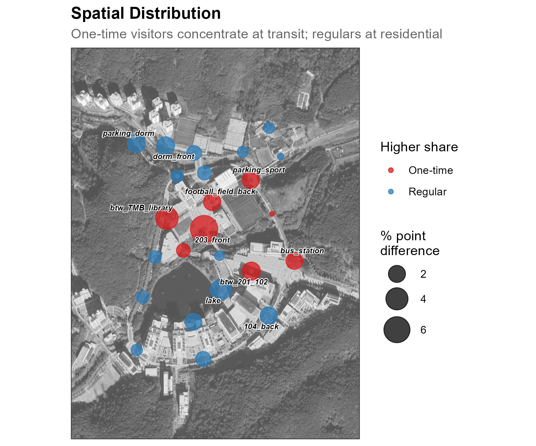
The difference map reveals a clear spatial divide. One-time visitors over-index at accessible, event-oriented locations: 203_front (+6.6 pp), btw_TMB_library (+4.1 pp), and btw_201_102 (+2.3 pp), all near campus entry points or public-facing buildings. Returning visitors dominate residential and daily-life sensors: lake (+3.2 pp), parking_dorm and dorm_front (+2.2 pp each), and 104_back (+2.0 pp). The map separates “visiting” locations from “living here” locations.
NoteShow code
s_freq_wide <- wifi_freq |>
  count(freq_type, sensor_name) |>
  group_by(freq_type) |>
  mutate(pct = n / sum(n) * 100) |>
  ungroup() |>
  select(freq_type, sensor_name, pct) |>
  pivot_wider(names_from = freq_type, values_from = pct, values_fill = 0) |>
  rename(pct_onetime = `One-time`, pct_regular = Regular) |>
  mutate(diff = pct_onetime - pct_regular,
         abs_diff = abs(diff),
         dominant = if_else(diff > 0, "One-time", "Regular")) |>
  left_join(sensor_coords, by = "sensor_name")

ggmap(base_map, darken = c(0.3, "white")) +
  geom_point(data = sensor_coords, aes(x = X, y = Y),
             size = 1.2, color = "grey60", inherit.aes = FALSE) +
  geom_point(data = s_freq_wide, aes(x = X, y = Y, size = abs_diff, color = dominant),
             alpha = 0.75, inherit.aes = FALSE) +
  scale_size_continuous(range = c(1.5, 10), name = "% point\ndifference") +
  scale_color_manual(values = c("One-time" = "#d7191c", "Regular" = "#2c7bb6"),
                     name = "Higher share") +
  labs(title = "Spatial Distribution") +
  theme_bw()
Spatial coverage
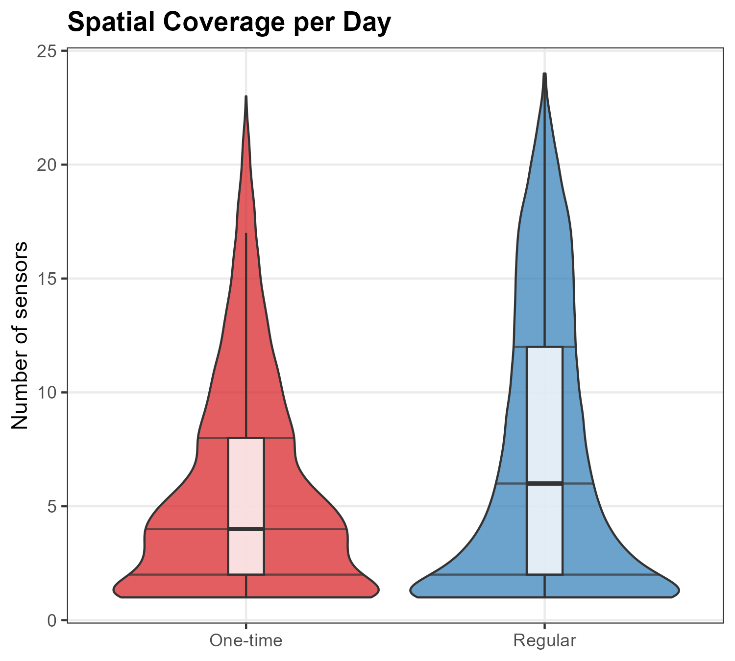
Beyond where devices go, we can ask how widely they range. On each visit (device-day), we count how many distinct sensors detected the device. Returning visitors visit a median of 6 sensors per day with a broad distribution reaching all 24 sensors; one-time visitors visit a median of 4, with a narrower range. The violin shapes make the difference clear: returning visitors’ wider body above 10 sensors reflects daily routines spanning multiple campus zones (dormitory, cafeteria, academic buildings, recreation), while one-time visitors concentrate at lower counts near the entry points they visit.
NoteShow code
visit_stats <- wifi_freq |>
  group_by(source_address, date, freq_type) |>
  summarise(n_sensors = n_distinct(sensor_name), .groups = "drop")

ggplot(visit_stats, aes(x = freq_type, y = n_sensors, fill = freq_type)) +
  geom_violin(alpha = 0.7, draw_quantiles = c(0.25, 0.5, 0.75)) +
  geom_boxplot(width = 0.12, fill = "white", alpha = 0.8, outlier.shape = NA) +
  scale_fill_manual(values = c("One-time" = "#d7191c", "Regular" = "#2c7bb6")) +
  scale_y_continuous(breaks = seq(0, 25, 5)) +
  labs(title = "Spatial Coverage per Day",
       x = NULL, y = "Number of sensors") +
  theme_bw() +
  theme(legend.position = "none")
Movement pattern
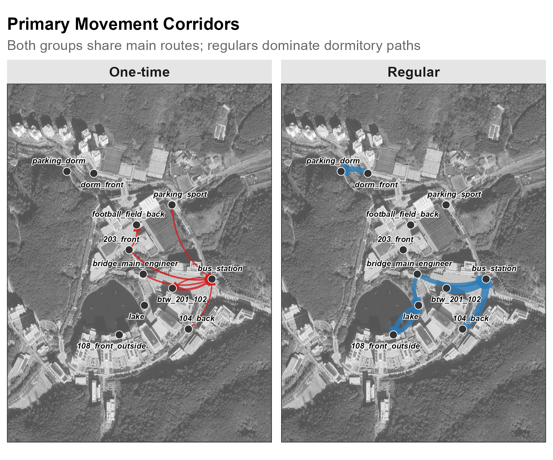
The flow maps reveal strikingly different movement structures. One-time visitors’ flows converge on bus_station: six of their top seven routes end there, tracing a clear arrival-visit-departure arc. The top one-time corridor (btw_201_102 → bus_station, 417 trips) is a direct path from the campus core to transit.
Returning visitors generate far more volume (top route: btw_201_102 → bus_station at 2,249 trips) but show greater route diversity. Their map includes campus-life corridors absent from one-time flows: dorm_front → parking_dorm (1,400 trips, residents reaching their parked cars) and lake ↔︎ 108_front_outside (1,267 / 1,116 trips, bidirectional recreational corridor). Trip counts here are built from the frequency-labeled detections before the localization step used in Track, so they are not directly comparable to that chapter’s all-device totals.
NoteShow code
od_freq <- wifi_freq |>
  arrange(source_address, timestamp) |>
  group_by(source_address) |>
  mutate(gap = as.numeric(difftime(timestamp, lag(timestamp), units = "mins")),
         trip_id = cumsum(is.na(gap) | gap > 30)) |>
  group_by(source_address, trip_id, freq_type) |>
  summarise(origin = first(sensor_name), destination = last(sensor_name),
            n_det = n(), .groups = "drop") |>
  filter(origin != destination, n_det >= 2) |>
  count(freq_type, origin, destination, name = "n_trips") |>
  group_by(freq_type) |>
  slice_max(n_trips, n = 7) |>
  ungroup()

# Join coordinates and plot as flow map with geom_curve
edges_freq <- od_freq |>
  left_join(sensor_coords, by = c("origin" = "sensor_name")) |>
  rename(x_from = X, y_from = Y) |>
  left_join(sensor_coords, by = c("destination" = "sensor_name")) |>
  rename(x_to = X, y_to = Y)

ggmap(base_map, darken = c(0.3, "white")) +
  geom_curve(data = edges_freq,
             aes(x = x_from, y = y_from, xend = x_to, yend = y_to,
                 linewidth = n_trips, color = freq_type),
             curvature = 0.25, alpha = 0.8,
             arrow = arrow(length = unit(0.18, "cm"), type = "closed"),
             inherit.aes = FALSE) +
  facet_wrap(~ freq_type) +
  labs(title = "Primary Movement Corridors") +
  theme_bw()
10.4 Frequency as a proxy for revisit profiles
The frequency-based classification produces consistent behavioral separation across all four dimensions. One-time visitors (40%) cluster at midday, concentrate at transit and event locations, cover a median of 4 sensors per day, and funnel toward the bus station. Returning visitors (33%) spread evenly across 24 hours, dominate dormitory and daily-life zones, range across a median of 6 sensors per day with a broader distribution, and circulate along diverse campus-life corridors.
Consistent separation across all four dimensions supports frequency as a practical proxy for a revisit profile. A simple day-count threshold (requiring no auxiliary data, no surveys, and no privacy-invasive tracking) separates two populations with genuinely different relationships to the campus.
NoteChoosing the threshold
The Returning threshold (5+ out of 7 days, labeled “Regular” in the code) identifies devices present on most deployment days (approximately 71% attendance). This is a conservative choice: relaxing it to 4+ days would include more devices but risk mixing in occasional visitors. The exact threshold should be calibrated to the deployment context:
- Short deployments (1–2 weeks): Use a high proportion (e.g., 5/7 ≈ 71%) since even returning visitors may miss a day
- Long deployments (1+ month): Absolute counts work better (e.g., 20+ days in a 30-day window)
- Event studies: Consider event-period vs non-event-period frequency separately
The key is that the threshold produces behaviorally distinct groups: if temporal, spatial, and movement patterns don’t differ meaningfully, the threshold needs adjustment.